Android
Alice Onboarding Android SDK allows the automatic capture of documents and video selfie of the user in real time from the camera of your device. It also simplifies the communication with the Onboarding API to facilitate rapid integration and development.

Note
Check our GitHub repo to be aware of our latest releases.
1. Installation
Our configuration
minSdkVersion = 21
targetSdkVersion = 30
compileSdkVersion = 30
gradleVersion = 4.1.2
kotlinVersion = 1.6.21
Adding the SDK dependency
repositories {
    mavenCentral()
    maven { url "https://europe-west1-maven.pkg.dev/alice-cloud/maven" }
    maven { url "https://jitpack.io" }
}
dependencies {
    implementation 'com.alicebiometrics.onboarding:AliceOnboarding:+'
}
2. Getting started
2.1 Permissions
Alice Onboarding needs to have the following permissions granted.
<uses-permission android:name="android.permission.CAMERA" />
2.2 Config your Alice Onboarding
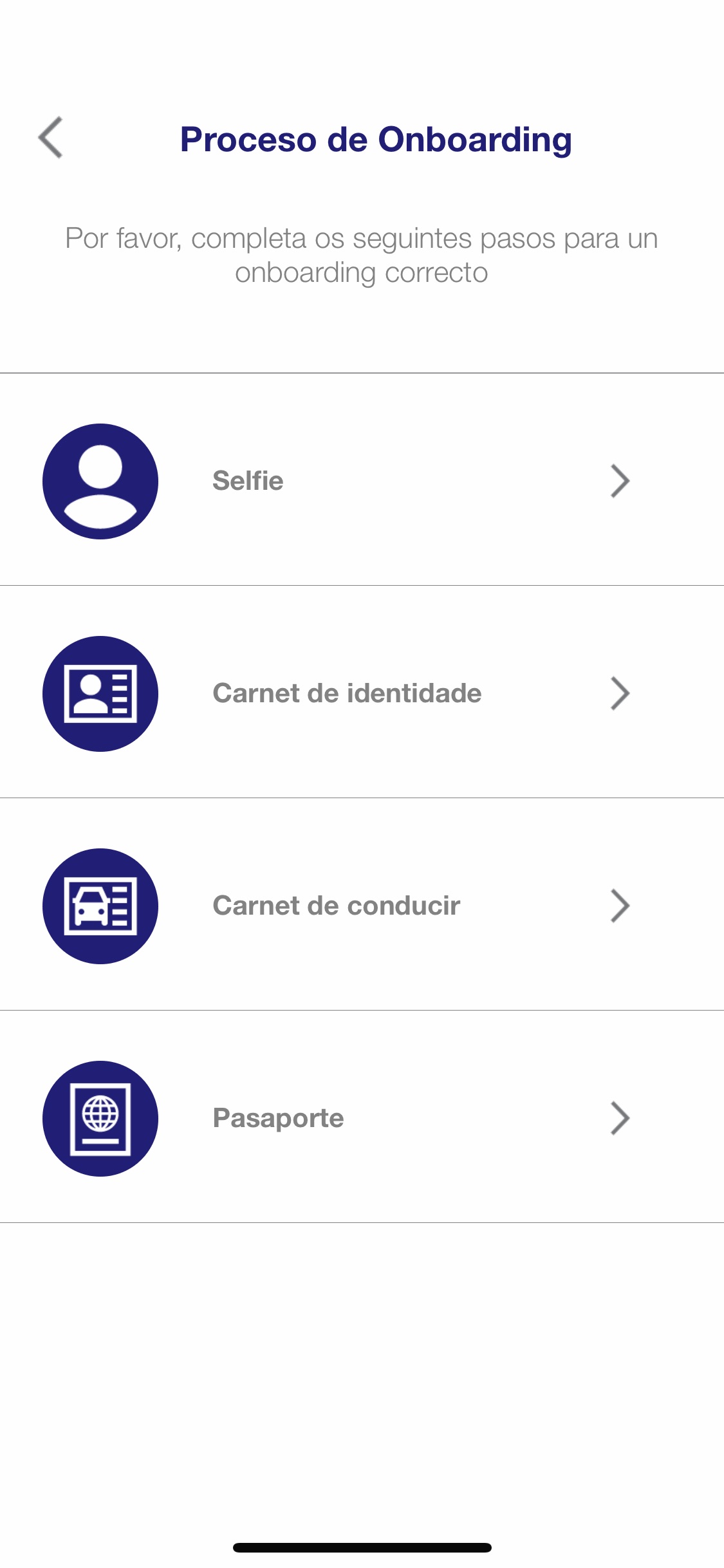
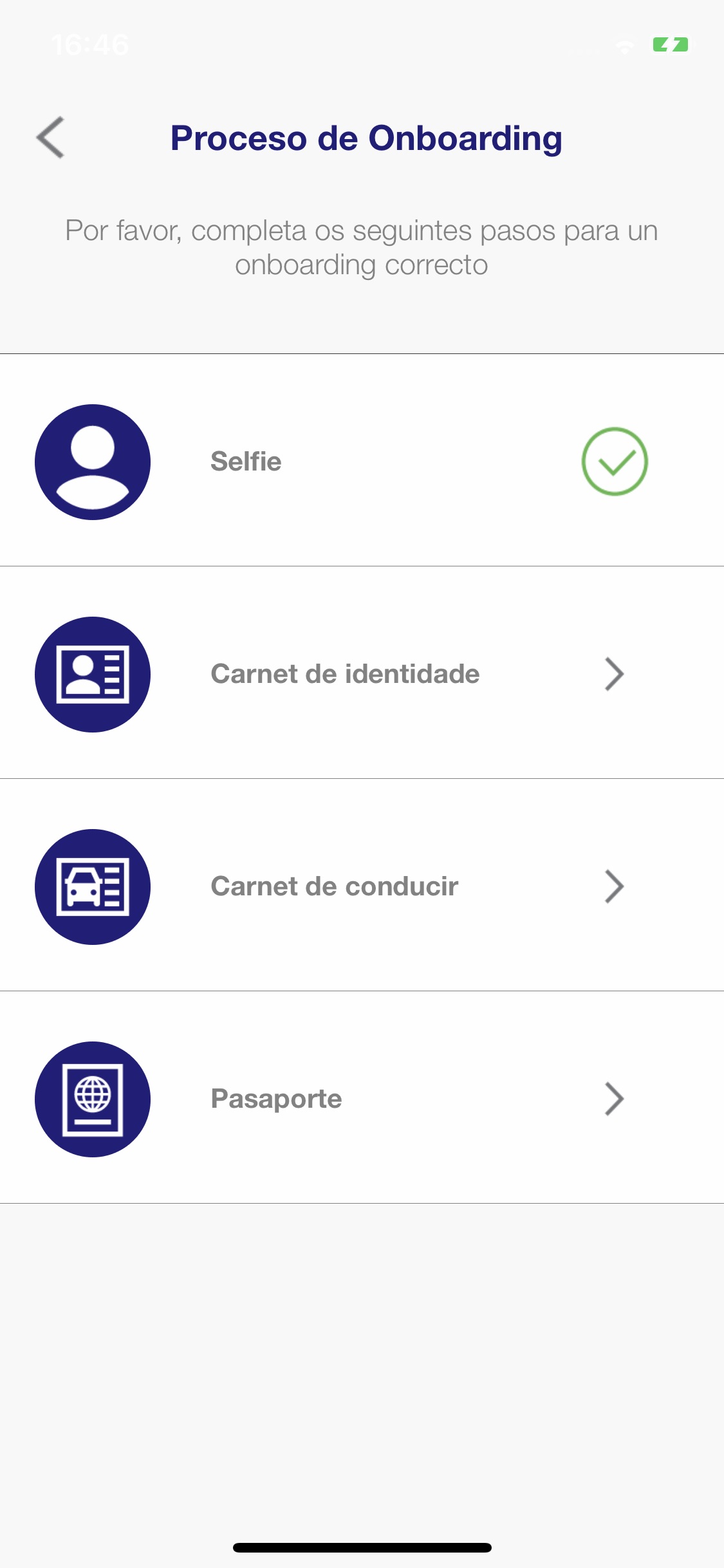
You can configure the onboarding flow with the OnboardingConfig
builder. The following snippet configures:
- A Selfie capture (
.withAddSelfieStage()) - Two different document stages for an Spanish ID Card and Driver License (
.withAddDocumentStage()). - A final stage to capture another trusted document (e.g. proof of address, bill, …) (
.withAddOtherTrustedDocumentStage())
To see the configuration details of each stage go to section Stages configuration
val userToken = "<ADD-YOUR-USER-TOKEN-HERE>"

val config = OnboardingConfig.builder()
    .withUserToken(userToken)
    .withAddSelfieStage()
    .withAddDocumentStage(type = DocumentType.IDCARD, issuingCountry = "ESP")
    .withAddDocumentStage(type = DocumentType.DRIVERLICENSE, issuingCountry = "ESP")
    .withAddOtherTrustedDocumentStage(title = "Proof of address")
- If you want the SDK to ask for the permissions internally, attach the following line:
config.askForPermission = true
Where userToken is used to secure requests made by the users on their mobile devices or web clients. You should obtain it from your Backend. Check it in authentication section 3. Authentication
2.3 Run Alice Onboarding
Once you configured the Alice Onboarding Flow, you can run the process with:
val onboarding = Onboarding(this, config = config)
    onboarding.run(ONBOARDING_REQUEST_CODE)
    }
}

...

override fun onActivityResult(requestCode: Int, resultCode: Int, data: Intent?) {
    super.onActivityResult(requestCode, resultCode, data)
        if (requestCode == ONBOARDING_REQUEST_CODE) {
            if (resultCode == Activity.RESULT_OK) {
                val userInfo = data!!.getStringExtra("userStatus")
        } else if (resultCode == Activity.RESULT_CANCELED) {

        }
    }
}
3. Authentication
For production environments is mandatory to use your backend to obtain the required USER_TOKEN. You should obtain it from your backend (see Authentication)
You can implement the Authenticator protocol available in the AliceOnboarding framework.
class MyBackendAuthenticator : Authenticator {

    override fun execute(callback: (Response) -> Unit) {

        // Add here your code to retrieve the user token from your backend

        val userToken = "fakeUserToken"
        callback(Response.Success(userToken))
    }

}
In a similar way to the authentication available with the sandbox:
val authenticator = MyBackendAuthenticator()

authenticator.execute { response ->
    when (response) {
        is Response.Success -> {
          // Configure Alice Onboarding with the OnboardingConfig
          // Then Run the Alice Onboarding Flow
        }
        is Response.Failure -> {
          // Inform the user about Authentication Errors
        }
    }
}
4. Stages configuration
4.1 Selfie stage configuration parameters
There are two different types of selfies available in this SDK
Selfie: standard selfie with passive liveness.Selfie with Challenge: the SDK will ask the user to put the document inside a random position after capturing the selfie.
config = config.withAddSelfieStage()

config = config.withAddSelfieWithChallengeStage()
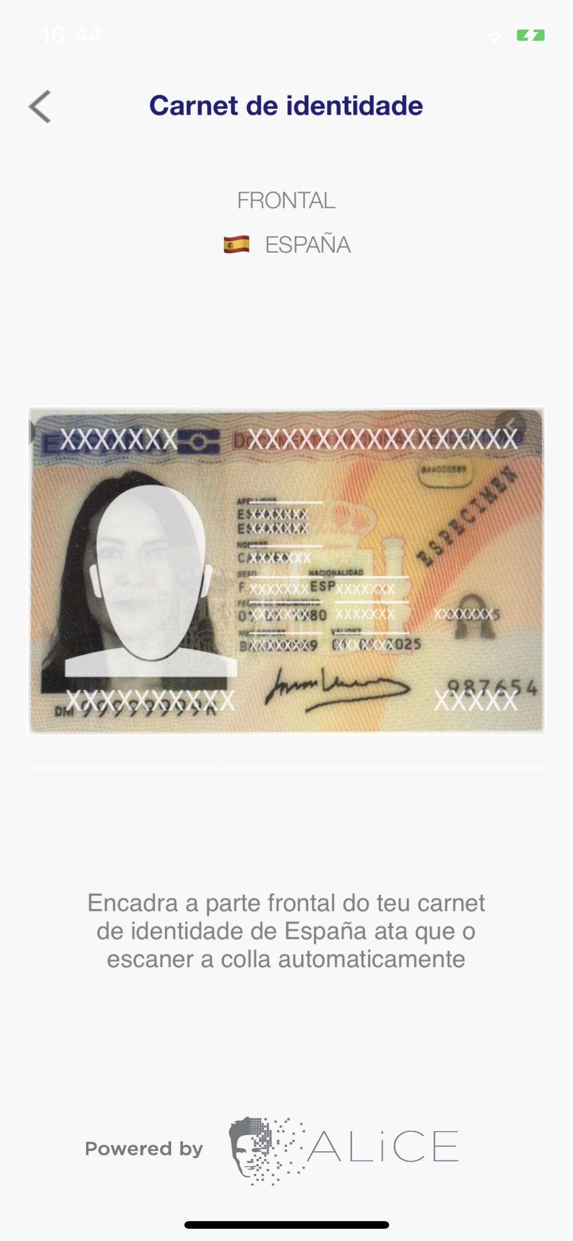
4.2 Document stage configuration parameters
config = config.withAddDocumentStage(
    type = DocumentType.IDCARD,
    issuingCountry = "ESP",
    documentStageConfig = documentStageConfig
)
withAddDocumentStage has the following parameters (in order):
type: type of document to capture. The enumDocumentTypecan be used to indicate the type (id card, driver license, residence permit, passport, health insurance card).issuingCountry: (Optional) country ISO 3166-1 alpha-3 code. If you don't set it, a menu will be shown where the user can choose the country.-
documentStageConfig: (optional) capture configuration parameters. -
DocumentStageConfigencapsulates different capture configuration parameters. Its constructor has the following parameters:attemptsToShowManualAlert: number of attempts of automatic capture before showing an alert giving the user the option to start a manual capture. Default value is2.withTorchFlash: boolean parameter to give the possibility to turn on the flash in the capture.
4.2 Other Trusted Document stage configuration parameters
This functionality is an easy way to have a document that is not necessarily identification (e.g. proof of address, bill, …).
There are two ways to use this feature:
- Uploading a file: It must be a PDF file and less than 10 MB in size.
- Capturing your document: You can add the sheets that are needed from your document. After each capture you can check if the image is correct and to finish you will press the send button that joins all the captures made and will generate a PDF.
withAddOtherTrustedDocumentStage has two arguments:
title: a title for this section during the onboarding process.category: this argument is required if your flow requires multiple documents. You must use this argument to tag each document, for example if your flow requires an invoice and a payslip you could use "invoice" and "payslip" as categories.
5. Customization
To improve the onboarding experience into your look and feel, Alice onboarding allows you to customize onboarding stages using your own style.
5.1. General & Fast Customization
Colors
You can define certain colors inside your own colors.xml file.
- onboardingPrimary: Defines button colors and main text.
- onboardingSecondary: Defines secondary text (Helping info).
- onboardingBackgroundColor: Defines the background color.
Font
You can define your regular and bold font inside your own styles.xml file.
<style name="onboardingClassicFontBold">
    <item name="android:fontFamily">sans-serif-medium</item>
</style>
<style name="onboardingClassicFontRegular">
    <item name="android:fontFamily">sans-serif</item>
</style>
and then select the classic font theme:
<style name="onboardingFontTheme">
    <item name="fontTheme">Classic</item>
</style>
5.2. Theme customization
We provide you up to 3 different themes to customize fonts and icons.
Font theme
You can change the default font between three different options. Just define onboardingFontTheme inside your own styles.xml file.
<style name="onboardingFontTheme">
    <item name="fontTheme">Classic</item>
</style>
Available values:
<attr name="fontTheme">
    <enum name="Corporative" value="0" />
    <enum name="Classic" value="1" />
    <enum name="Modern" value="2" />
</attr>
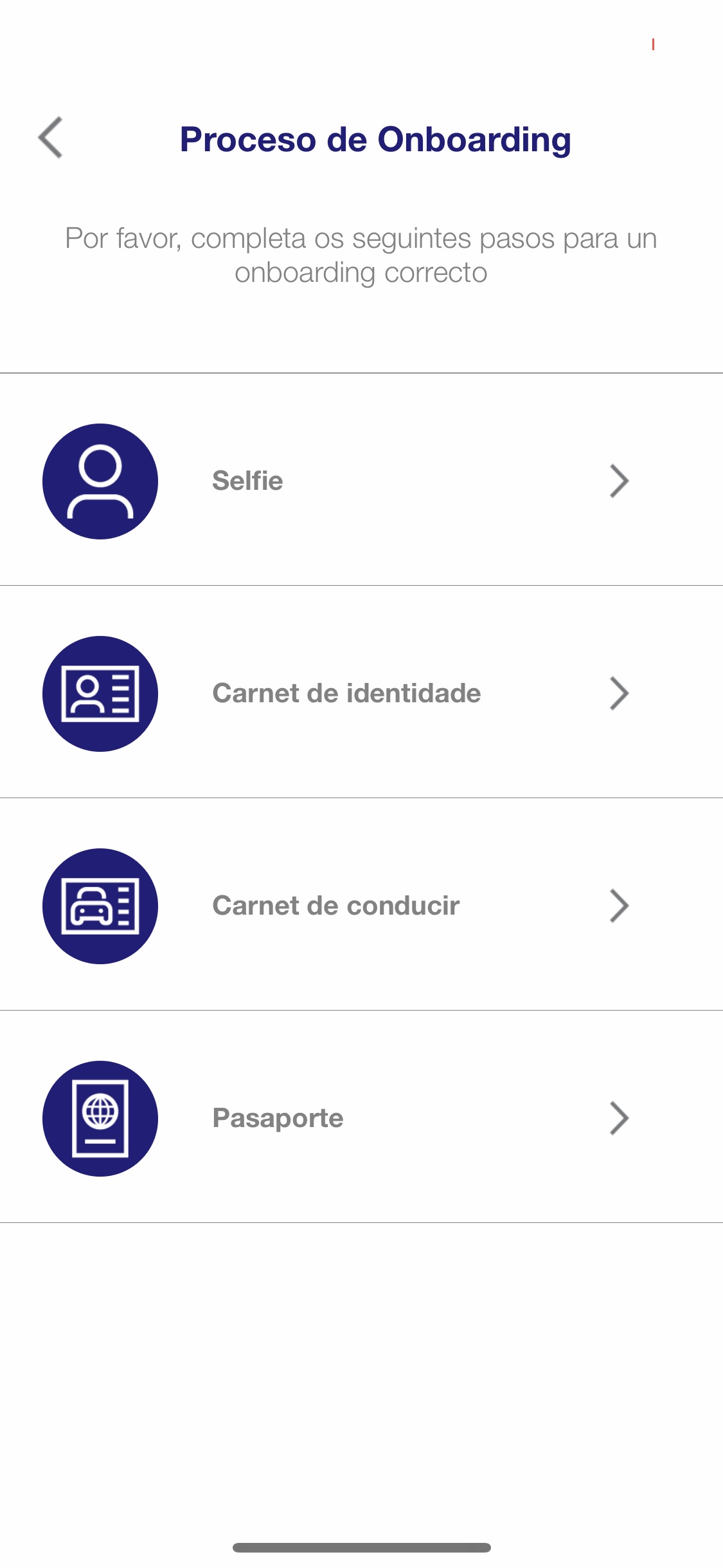
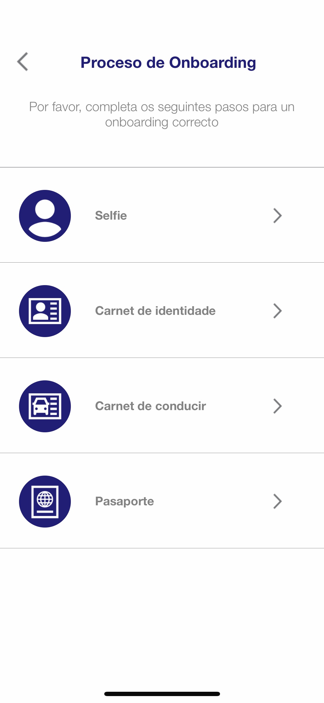
Icons Theme
You can change the default icons theme between three different options. Just define onboardingIconsTheme inside your own styles.xml file.
<style name="onboardingIconsTheme">
    <item name="iconsTheme">Classic</item>
</style>
Available values:
<attr name="iconsTheme">
    <enum name="Classic" value="0" />
    <enum name="Minimal" value="1" />
    <enum name="Modern" value="2" />
</attr>
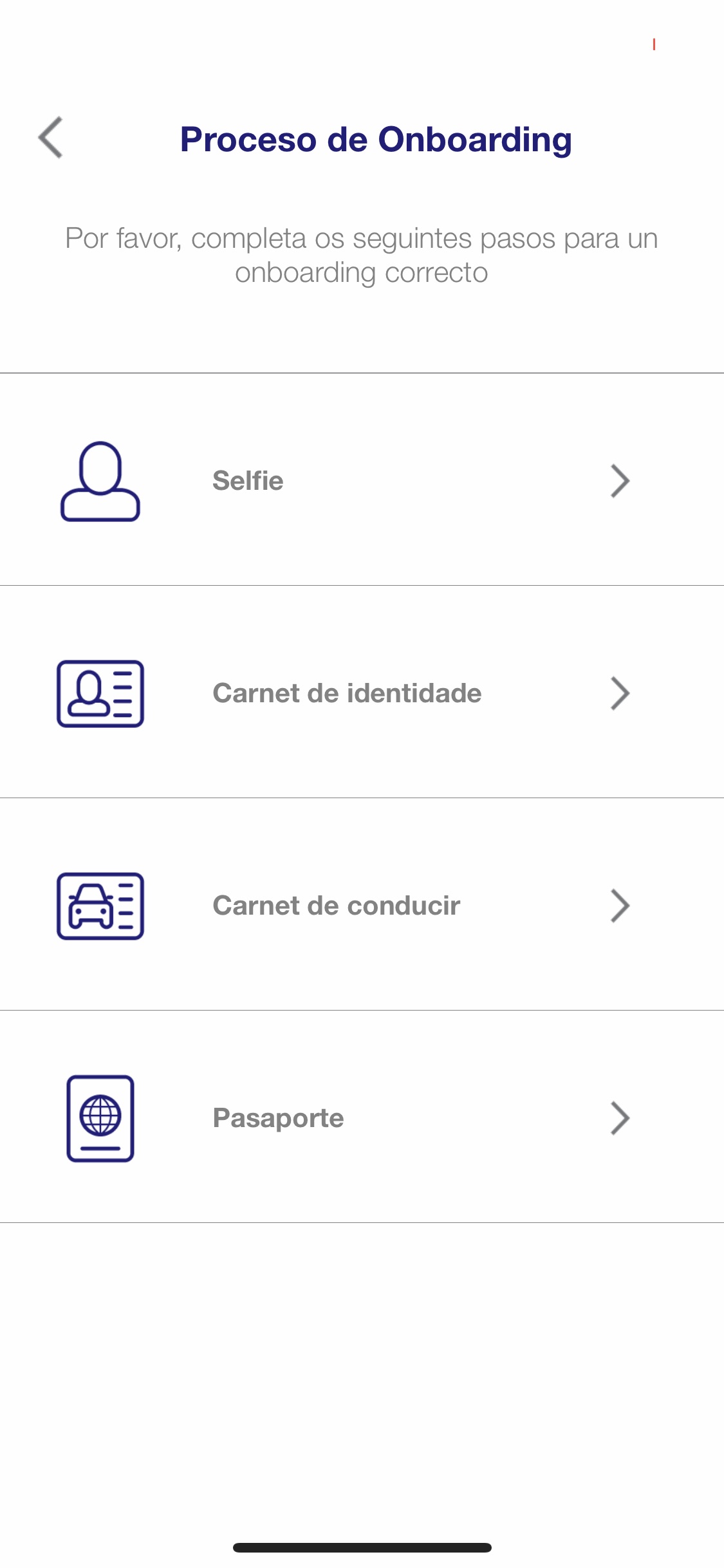
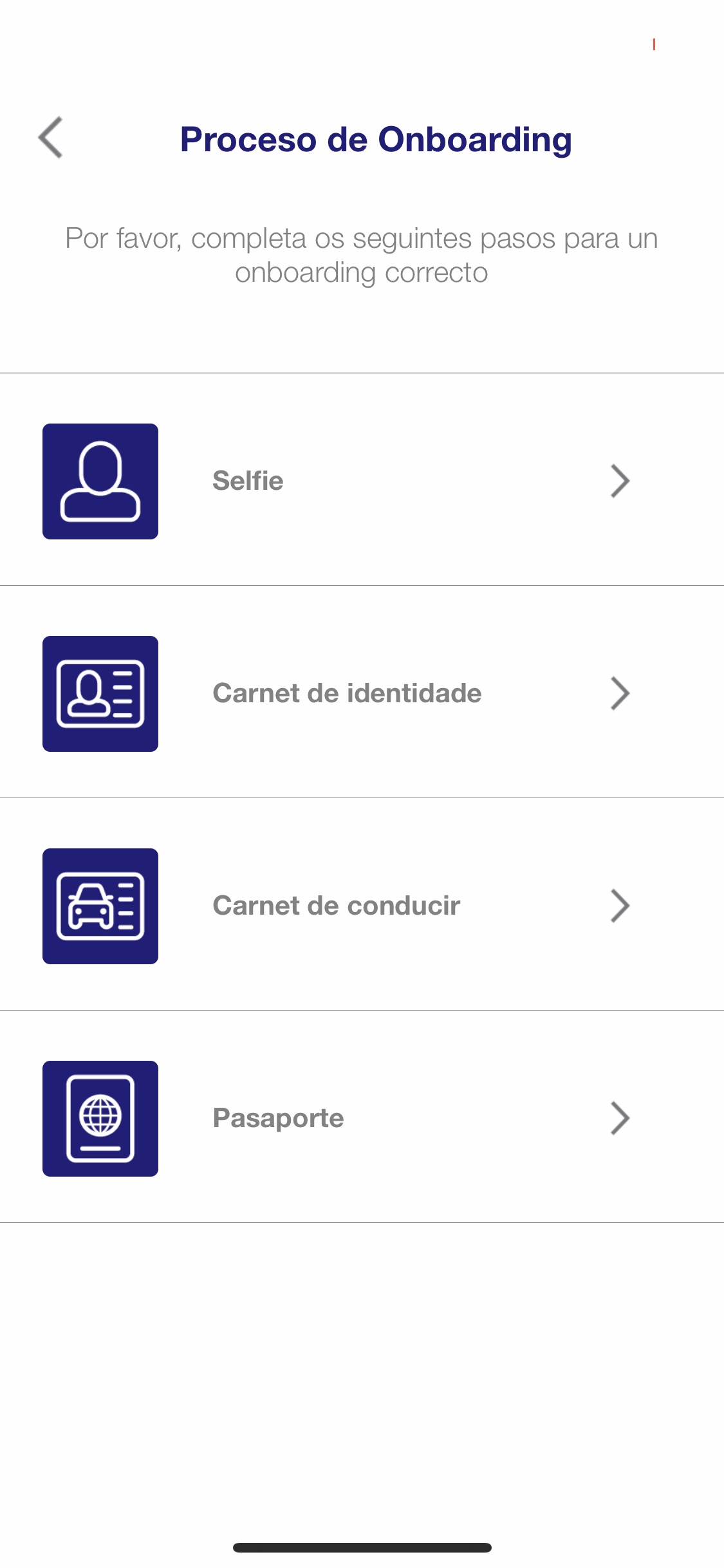
Icons Style
You can change the default icons style between three different options. Just define onboardingIconsStyle inside your own styles.xml file.
<style name="onboardingIconsStyle">
    <item name="iconsStyle">Circle</item>
</style>
Available values:
<attr name="iconsStyle">
    <enum name="Circle" value="0" />
    <enum name="Shape" value="1" />
    <enum name="Square" value="2" />
</attr>
5.3 Fine customization
If you want a more specific customization without using the default themes this is your section.
There are 4 views and 1 alert dialog with configurable values:
Define certain colors inside your own colors.xml
<color name="statusViewBackgroundColor">@color/onboardingColorWhite</color>
<color name="statusViewCardBackgroundColor">@color/onboardingColorWhite</color>
<color name="statusIconBackgroundColor">@color/onboardingColorWhite</color>
<color name="statusViewContinueButtonColor">@color/onboardingPrimary</color>
To change text appearance, define inside your own styles.xml
<style name="statusViewTitleTextAppearance">
    <item name="android:textSize">24dp</item>
    <item name="android:textColor">@color/onboardingPrimary</item>
</style>
<style name="statusViewSubtitleTextAppearance">   . . .    </style>
<style name="statusViewButtonTextAppearance">     . . .    </style>
<style name="statusViewCardTextAppearance">       . . .    </style>
To change icons, first set the onboardingIconsTheme to Custom inside your own styles.xml
<style name="onboardingIconsTheme">
    <item name="iconsTheme">Custom</item>
</style>
and then define inside your own drawable folder the following resources (at least 50×50 dp):
- onboarding_arrow.xml
- onboarding_face.xml
- onboarding_id_card.xml
- onboarding_driver_license.xml
- onboarding_passport.xml
- onboarding_resident_permit.xml
SelfieCaptureView

Define certain colors inside your own colors.xml
<color name="captureViewBackgroundColor">@color/onboardingColorWhite</color>
<color name="captureViewGradientStartColor">#0CFFFFFF</color>
<color name="captureViewGradientEndColor">#FFFFFFFF</color>
<color name="selfieCaptureViewEdgeRightMaskColor">@color/onboardingColorGreen</color>
<color name="selfieCaptureViewWrongMaskColor">@color/onboardingColorWhite</color>
To change text appearance, define inside your own styles.xml
<style name="selfieCaptureViewTitleTextAppearance">
    <item name="android:textSize">24dp</item>
    <item name="android:textColor">@color/onboardingPrimary</item>
</style>

<style name="selfieCaptureViewSubtitleTextAppearance">  . . . </style>
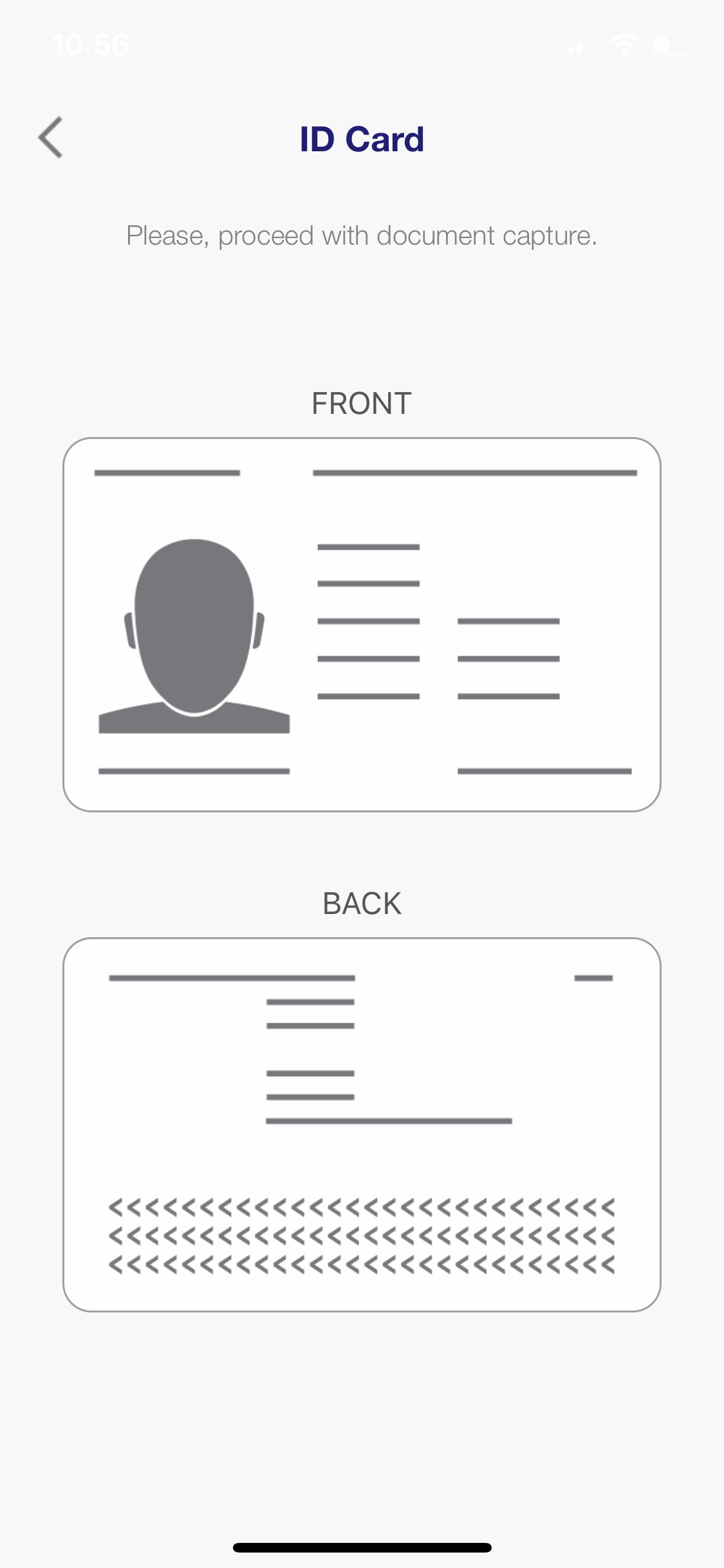
DocumentIntermediateView
Define certain colors inside your own colors.xml
<color name="documentIntermediateViewBackgroundColor">@color/onboardingColorWhite</color>
<color name="documentIntermediateCardBackgroundColor">@color/onboardingColorWhite</color>
To change text appearance, define inside your own styles.xml
<style name="documentIntermediateViewTitleTextAppearance">
    <item name="android:textSize">24dp</item>
    <item name="android:textColor">@color/onboardingPrimary</item>
</style>

<style name="documentIntermediateViewSubtitleTextAppearance">  . . .    </style>
<style name="documentIntermediateViewCardTextAppearance"> . . . </style>
To change icons, define inside your own drawable folder the following resources:
onboarding_doc_mask_front.xmlonboarding_doc_mask_back.xml
DocumentCaptureView
Define certain colors inside your own colors.xml
<color name="captureViewBackgroundColor">@color/onboardingColorWhite</color>
<color name="captureViewGradientStartColor">#0CFFFFFF</color>
<color name="captureViewGradientEndColor">#FFFFFFFF</color>
<color name="documentCaptureViewRetryButtonBackgroundColor">@color/onboardingColorTransparent</color>
<color name="documentCaptureViewSendButtonBackgroundColor">@color/onboardingPrimary</color>
<color name="documentCaptureViewTriggerCameraButtonColorStroke">@color/onboardingColorGray</color>
<color name="documentCaptureViewTriggerCameraButtonColorBackground">@color/onboardingSecondary</color>
To change text appearance, define inside your own styles.xml
<style name="documentCaptureViewTitleTextAppearance">
    <item name="android:textSize">24dp</item>
    <item name="android:textColor">@color/onboardingPrimary</item>
</style>

<style name="documentCaptureViewSubtitleTextAppearance">  . . . </style>
<style name="documentCaptureViewInfoTextAppearance"> . . . </style>
<style name="documentCaptureViewSendButtonTextAppearance">  . . . </style>
<style name="documentCaptureViewRetryButtonTextAppearance"> . . . </style>
To change icons, define inside your own drawable folder the following resources:
- onboarding_back_id_template_no_frame.xml
- onboarding_front_id_template_no_frame.xml
- onboarding_passport_template_no_frame.xml
- onboarding_front_driver_license_no_frame.xml
- onboarding_back_driver_license_no_frame.xml
- onboarding_front_resident_permit_template_no_frame.xml
- onboarding_back_resident_permit_template_no_frame.xml
Alert dialog
Define certain colors inside your own colors.xml
<color name="customAlertDialogTitleColor">@color/onboardingPrimary</color>
<color name="customAlertDialogSubtitleColor">@color/onboardingSecondary</color>
<color name="customAlertDialogButtonColor">@color/onboardingPrimary</color>
5.4 Localization
Alice Onboarding SDK provides several default translations for the following locales:
| Locale | Code |
|---|---|
| Arabic | ar |
| Catalan | ca |
| German English | de |
| Greek | el |
| English in United Kingdom | en-rGB |
| English in Ireland | en-rIE |
| English in United States | en-rUS |
| Spanish | es |
| Spanish in Spain | es-rES |
| Basque | eu |
| Finish | fi |
| French | fr |
| Italian | it |
| Galician | gl |
| Japanese | ja |
| Dutch | nl |
| Polish | pl |
| Portuguese | pt |
| Portuguese in Brazil | pt-rBR |
| Russian | ru |
| Swedish | sv |
| Turkish | tr |
| Simplified Chinese | zh |
By default, the SDK infers what is the default language to use. If locale does not exist, it uses English.
In addition, you can also provide custom translations (or different
texts) to clarify whatever you want in your app. To do this, you just
need to add an XML string file inside your app resources
folder for the desired locale (e.g
res/values-{<LOCALISATION-CODE>}/alice_onboarding_strings.xml). In
this way, you can overwrite the text keys that you want to change.
The default messages can be found here.